Cosmetic Logo Design for Benyo Vietnam
Why Cosmetic Logo Design Shapes Beauty Brands
In the highly competitive beauty market, first impressions are often formed within seconds. Long before customers experience a product’s texture, fragrance, or performance, they encounter the brand visually. This moment of visual contact is where cosmetic logo design becomes a strategic asset rather than a purely decorative element.
A well-crafted logo communicates trust, quality, and emotional value at a glance. For beauty brands—especially those working with premium skincare—the logo must convey refinement, safety, and transformation. These are the values modern consumers look for when choosing products they will apply directly to their skin.
The logo of Benyo Vietnam demonstrates how thoughtful cosmetic logo design can elevate brand perception while creating a foundation for long-term recognition.
Benyo Vietnam and the Brand Context
Benyo Vietnam is headquartered in Dan Phuong District, Hanoi, and operates as an exclusive distributor of authentic cosmetic brands from Korea and Japan. With a strong focus on product quality and skin compatibility for Asian consumers, the company represents well-known names such as Prettyskin, Habaria, and Raip.
This positioning requires a brand identity that feels both trustworthy and aspirational. On one hand, it must reflect professionalism and international partnerships; on the other, it should remain approachable and emotionally resonant with local customers. The Benyo logo was developed to bridge these expectations, serving as a visual expression of credibility, care, and modern beauty values.

The Benyo Cosmetic Logo Design Concept
Every successful cosmetic logo design begins with a clear and intentional concept. Rather than relying on abstract forms or overly complex visuals, the Benyo logo is built around a symbol that feels intuitive within the beauty industry.
Before examining individual design elements, it is important to view the logo as a complete visual system—one where symbolism, color, and typography work together to express a unified brand message.
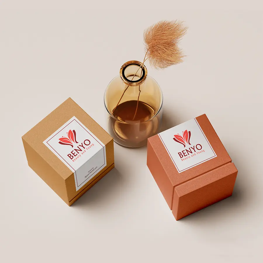
1. The Butterfly Symbol
At the heart of the Benyo logo is the butterfly, a symbol widely associated with transformation and renewal. In cosmetic branding, this symbolism aligns naturally with the journey of skincare: nurturing the skin over time to reveal a more radiant, confident appearance.
The butterfly in Benyo’s logo is delicately stylized, emphasizing balance and symmetry rather than realism. This design choice suggests controlled elegance and refinement, reinforcing the idea that beauty is cultivated through care and consistency, not excess. Beyond transformation, the butterfly also conveys lightness and purity—qualities closely linked to gentle skincare and long-term skin health.
2. Color Psychology in Cosmetic Logo Design
Color plays a decisive role in cosmetic logo design because it directly influences emotional perception. Benyo’s logo uses a refined shade of red as its primary color, carefully balanced to avoid appearing aggressive or overpowering.
When applied thoughtfully in beauty branding, red symbolizes vitality, confidence, and inner strength. In Benyo’s case, it also reinforces the promise of rejuvenation and active care—qualities customers expect from high-quality cosmetic products. This color choice ensures strong visibility across packaging, digital platforms, and marketing materials while maintaining a premium, modern feel.
3. Typography and Layout in Cosmetic Logo Design
Typography is an essential part of the Benyo visual system. The logo features clean, modern lettering with soft curves that complement the butterfly symbol rather than competing with it.
The typeface remains legible at both large and small sizes, an important consideration for cosmetic packaging where space is often limited. Balanced spacing between the symbol and the brand name creates a harmonious layout, allowing the logo to remain clear and recognizable across different applications. This minimalist approach reflects design sensibilities commonly seen in Korean and Japanese cosmetic brands, where clarity and simplicity are associated with trust and product safety.
How the Cosmetic Logo Design Performs Across Brand Touchpoints
A strong cosmetic logo design must perform well beyond visual appeal. The Benyo logo was developed with versatility in mind, ensuring consistent performance across a wide range of brand touchpoints.
It adapts seamlessly to product packaging and cosmetic labels, digital interfaces such as websites and social media profiles, and printed promotional materials. Even when scaled down or reproduced on different materials, the logo maintains clarity and recognizability—an essential quality for sustainable brand growth.
What the Logo Communicates About Benyo
More than a visual identifier, the Benyo logo communicates the brand’s core values. It reflects a commitment to natural, refined beauty, an emphasis on youthfulness supported by long-term care, and a sense of professionalism expected from an official cosmetic distributor.
Through its carefully considered cosmetic logo design, Benyo positions itself as a brand that understands both aesthetics and responsibility in beauty care, reinforcing trust at every point of customer interaction.
With its butterfly-inspired symbol, refined red palette, and balanced typography, the cosmetic logo design for Benyo Vietnam brings together symbolic meaning, modern aesthetics, and practical usability. Rather than following short-lived design trends, the logo establishes a strong visual foundation that can grow alongside the brand, supporting Benyo Vietnam’s mission and strengthening recognition over time.